Women Entrepreneurs: Creating the Brand

This post is the third in a four-part series about creating a new entrepreneurship program, the Missouri Women’s Business Center, while simultaneously helping entrepreneurs start and grow their own businesses. Read Part 1 and Part 2.
Depending on your perspective, it can be the most fun or the most painful part of building your business. It relies on market research, creativity, introspection, and an undefinable ability to know if something looks/feels/sounds cool. You find yourself alternately full of great ideas or completely devoid of a single thought. There’s no way to know you have it until, one day, you just know.
I’m talking about creating your brand.
I fall in the “most fun” camp, and so as I started working on the Missouri Women’s Business Center program, I knew I wanted to take care of the branding myself. But you don’t have to do it on your own. One of the great things about Columbia is we’re full of fantastic branding and marketing firms (and most of them are owned by women!).
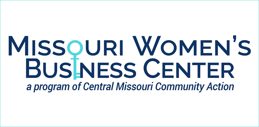
Building a brand starts with identifying how you want people to feel about your business. I knew I wanted the MoWBC to feel friendly, inclusive, professional, fun, and modern. I started with colors and fonts, and I also knew I wanted our logo to include a symbol. For the colors, I wanted something that would complement the CMCA logo (our host organization, explained in Part 1), which is navy and magenta. We decided to keep the navy and paired it with a turquoise. For the fonts, I wanted a distinctive “W,” since our focus would be women, and then we used the pairing recommendations on the Google Fonts website to identify a more basic font.
The symbol was a little trickier — it was definitely an evolution that took a fair bit of brainstorming. I’m a kinesthetic thinker, so my husband and I took a hike and kicked around ideas. I fixated on a phrase that I wanted to describe the Women’s Business Center: we would be positive and realistic with our clients. Incorporating a plus sign, for positive, was obvious. After a lot of discussion, we came up with the circle as a symbol for realistic: taking a 360-degree view of a business. Then the big question was how to combine the circle and the plus and not end up looking like the American Red Cross.
Then it hit us. A circle stacked on top of a plus sign is essentially the symbol for female. It seemed like a perfect match and completely meant to be ( I was a little concerned about the implications around the binary gender identity symbol, but I felt that it is still used in enough contexts that we could still ensure we have an inclusive environment). Somehow, we made the leap that if you stretched it out, it would look like a key, and we added an equals sign to represent equality, and then we had our symbol. Almost as an afterthought, my husband said something along the lines of, “It’d be kind of cool if you could incorporate it into the text.” The rest is history.

But branding goes beyond fonts, colors, and symbols. It is everything people associate with your business. We had a little misstep with our social media branding early on that none of us noticed until we started talking to prospective clients and supporters. One of our favorite group photos, which we used in most of our materials, was of our Chamber of Commerce ribbon cutting. It’s just what you’d expect of a ribbon cutting photo: lots of diverse people crammed in, many hands on the scissors, and the big yellow ribbon right in front.
A few months in, an experienced and passionate woman business owner who I was hoping to involve in the MoWBC told me she thought the optics of the photo were terrible. When she and her team saw the photo, they saw that our CMCA executive director and board president, both men, were reaching across the front of the photo to hold the scissors. This made it appear like they were holding the women back. I’d never seen the image in that light — I know both men well and that is opposite their personalities — but branding isn’t about what your images communicate to you; it’s about what they communicate to others. So I replaced the picture on our Facebook cover photo and website right away.
This kind of misstep can happen to anyone (and isn’t the only branding hiccup we’ve had at the MoWBC), which is why it’s important to seek feedback and opinions. I really respect that woman business owner for saying something to me, and it certainly made me more aware of how we pose for photos now.
We strive each day to uphold to our friendly, inclusive, professional, fun, and modern brand identity at the MoWBC. Sometimes we fall short, but it helps to know who and what we want to be. And, essentially, that’s our brand.
Jaime Freidrichs is the director of the Missouri Women’s Business Center. She blogs about women in entrepreneurship for CBT.


