Why We Should Be Graphically Designing Our City
In urban development circles, it’s common to talk about public art as a way to create a strong identity for an area. For hundreds of years, cites have placed works of art in their public squares, and that tradition continues today.
But what we tend to overlook is the power of graphic design in our cities. It’s the little stuff — using images, words, or graphic forms to convey a message or an identity. We might not think of it as “real art,” and the impact of graphics may too subtle to spark our imagination. But it’s time we all took a second look at how smart graphic design can help transform an area in unexpected ways.
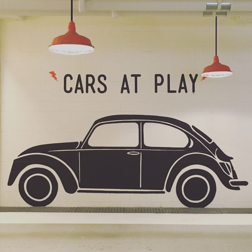
A great example is parking garages. Visitors need to quickly understand where to park, where to pay, and how to find the exit. They also need to remember where they left the car after a day of shopping.
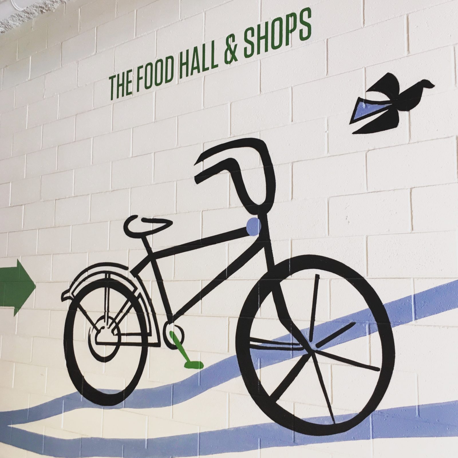
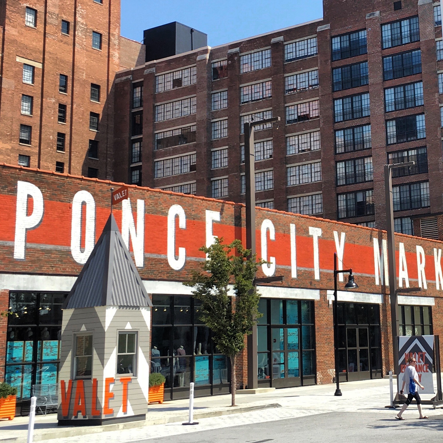
The traditional public works approach is to add signs — if people are confused, add more signs until they’re not confused. A graphic designer, on the other hand, will use color, images, and forms to convey this information. Ponce City Market — a rehabbed Sears & Roebuck warehouse in Atlanta now home to retail shops, restaurants, and creative offices — does a fantastic job of using graphics to enhance the visitor experience. In their parking garage, a playful image of a car points drivers to the correct ramp while the image of a bike lets everyone know where the bike parking is located. Colorful arrows and welcoming messages guide visitors through the garage to the adjacent shops.
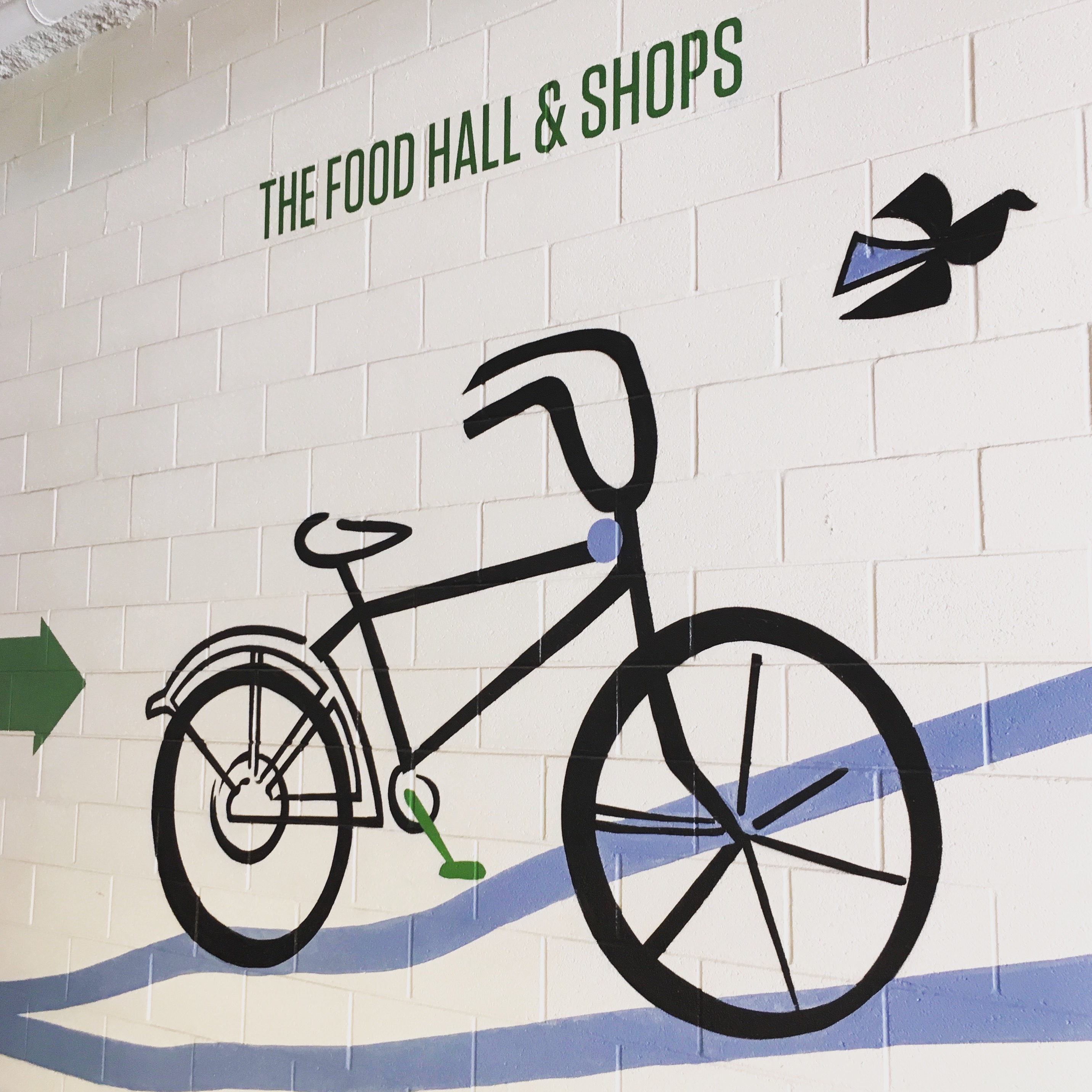
But the parking garage is just the beginning. Ponce City Market also integrates graphic design into the overall architecture of the building. The bright orange graphics are so playful a visitor may not notice they’re being purposefully directed through the building. These graphics not only convey information; they express the market’s identity.
To attract high-end creative workers, the workspaces themselves need to reflect this creativity. Employees of architectural firms, tech startups, and online marketing companies aren’t going to be interested in working out of a plain white box. Ponce City Market knows that, and they use graphic design to get an edge in attracting these employees.
And they’re not alone in their efforts. Cities are increasingly using graphic design for urban planning — as a substitute for traditional signage, to enliven a street, or even to bring attention to the planning process itself.
One key selling point of our new urban design team Arcturis was their understanding of the power of graphic design to quickly create an identity for The Loop. For a project that will be primarily focused on infrastructure improvements, it’s important to remember that turning lanes and sidewalks, while important, aren’t enough to convey a sense of place. Smart graphic design elements will help us convey a message, guide visitors, and manage interactions. But, most importantly, it can help us tell the story of The Loop.
Carrie Gartner is the director of The Loop community improvement district and a contributor to CBT.


