Home away from home

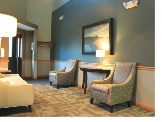
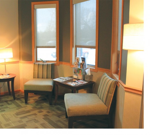
 It had been at least a decade, more like 13 years, since Dr. Bryan Foote had bothered with office restorations. But then it happened. The inevitable became true. No longer could he ignore that it was time for a major overhaul in his office’s appearance.
After all, Foote says, the office is where he and his employees spend a big portion of time every day. It ought to be a welcoming environment certainly for customers, but also for themselves.
And so it came to be. All the floors, walls and countertops were refinished, and new furniture was brought in. The front office and the sterilization area were revamped, with special attention to ergonomics and organization. Perlow-Stevens Gallery and Columbia artist Steve Ross helped select fresh, local artwork for visual interest.
“The response has been nothing but positive from customers and employees,” Foote says. “Now, looking back, I would absolutely recommend hiring professional help for this kind of a job. There was way too much work to be coordinated. I thought that going in; and now being on the other side, I know it for certain.”
 Going with the flow
For his restoration project, Dr. Foote worked closely with Jessica Chester, design team manager for Marathon Building Environments. While the company offers the full range of renovation services, one of its primary areas of expertise is in creating design to improve office flow.
“Our job is to think about the subtle cues that most people don’t think about on a conscious level,” Chester says. “We tend to think of design as being visual, but it’s also very much about functionality and message. And when we’re creating plans for our designs, those decisions are based on the company’s needs. Form follows function.”
Sometimes, simply changing the carpet color or pattern at a certain threshold can help define what’s public and what is private, she explains. “Everything sends a message — patterns, walls, colors — and it’s our job to listen to the client, make sure we understand that company’s message and help them communicate that message in a nonverbal, visual way.”
Interior designer Priya Batchu is currently working on restorations to the neonatal intensive care unit at University Hospital. Once complete, the space will provide a soothing, stress-free visiting area and kitchen space for visiting families.
Although the hospital is a big job, not every job is. Nor does it have to cost a fortune. But whether an office has two or 2,000 employees, Batchu says it’s important to create a strong visual impression.
“When clients arrive to your business, they want to see a clean environment,” Batchu says. “And, of course, most people spend more time at work than at home these days. So it’s important to have a pleasant atmosphere — not too comfortable, but a place where employees can feel good and do good work.”
Likes, dislikes and budget
Batchu begins every job with two main pieces of information: the client’s likes and dislikes, and his or her budget goal. From there, she works on finding the products, furnishings and color schemes that will keep their good looks for long term, for about the next five to 10 years.
Accessories and materials can also do a lot to update a workspace without breaking the bank. Lighting is always important. Plants cost little and add a lot in terms of color, positive energy, noise reduction. “In business, your finances go up and down,” Batchu says. “So you don’t always want to tie up money in looks. But it is important to keep a clean, inviting appearance.”
The least expensive, most effective change a business owner could make, Batchu suggests, would be paint color. She also recommends installing carpet tiles rather than rolls. That way, when accidents happen, a repair means replacing a square, not an entire floor.
Batchu says some of the current “hot” colors are navy and cobalt blues, oranges of all shades, hot pinks and emerald and lime greens. Gray is the big neutral this year, particularly in “layers” — using different shades of the same color to bring a room together.
“But color trends come and go,” Batchu says. “I have never really gone with what’s ‘in style.’ In the business world, I like to stay with soothing colors. If my clients give me colors they like, I can make them current.”
First impressions
In many cases, creating a professional appearance happens before the client walks through the front door. Columbia Turf provides landscape maintenance for many businesses in town, including State Farm, MFA Oil and Miller’s Professional Imaging. More and more, the company sees a trend toward maintaining outside break areas, garden spaces and walking paths for employees and visitors.
“We’re living in a busy society,” says Miguel Rios, design coordinator for the company’s landscape division. “In today’s world, we get limited time at home, and many people crave fresh air and sunshine.
“Good landscaping and outside areas can bring a sense of vitality to the workplace. Just to see nature at your window makes the work day more pleasant.”
Rios suggests that business dollars put into landscaping is money that grows. There tends to be more financial return on landscape investments than on structural renovations. “Landscaping isn’t really an expense, but rather an investment,” he says. “You plant sozmething today, and over a few years it has increased in value.”


