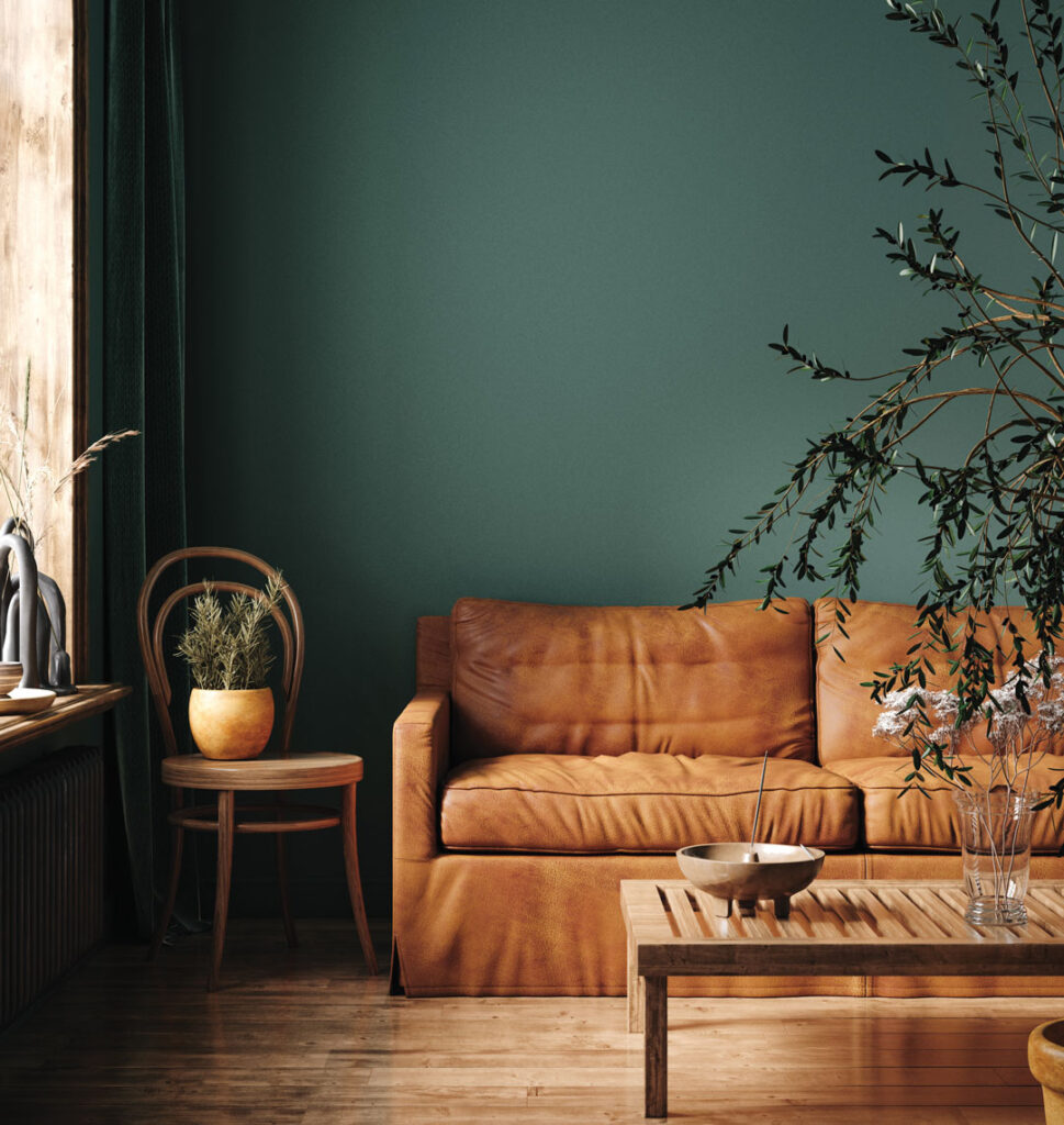
Pumpkin Spice and Everything Nice:the Season of Color

October brings a sense of anticipation and a sort of calm: The biggest holidays are just around the corner, but for now you’re catching your breath from the back-to-school season that has settled down by now. While you’re catching your breath and relaxing in your most comfortable space — your living room, bedroom, or dining room — why not take stock of the feeling that your guests and other family members experience?
The best place to start that mental checklist is considering the color schemes of furniture, accessories, floor coverings, lighting, and bedding. How well do those schemes match the wall colors? Maybe it occurs to you that a color change here, a new piece of furniture there could actually make your space feel more open and welcoming or, perhaps, cozier and more welcoming.

You can take some clues from Mother Nature and the incredible splashes of color on the autumn landscape. It just all “fits,” doesn’t it? What would Mother Nature do to coordinate the colors in your living space? Here are some tips.
- Before getting into the nitty gritty of design trends, new styles, or changing anything even a little, first identify what your furniture, bedding, and accessories are meant to do: They are an extension of you, your style, and you and your family’s personality. Does the color, the furniture sets and arrangements, and transition from one room to another work for YOU?
- Are you a fabric, leather, or faux covering furniture owner? What colors are most natural for your style? (If you love bold color and patterns, fabric generally has more options.)
- Open spaces can be a canvas for experimenting with different color schemes and styles, or you can go with simple, so-called “safe” colors that elicit a calming effect. What are “safe” colors? Black, white, gray, and brown. These colors typically mesh well with a vast majority of décor styles and are not easily altered by trends. These colors help make furniture feel timeless. Black accents dark and dramatic spaces and fits with most color palettes. White is light and airy and matches with anything. Gray has a crisp, fresh, contemporary feel. Brown has a rich and earthy aura, a classic that has proven timeless.
- As a good rule of thumb, select one color to be your “neutral” color then add on from there. If it’s a cool color, warm accents are good accessories. If you’re using blue and white, take care not to make them look too cold. (A darker shade slipcover or throw pillow can easily “warm” things up.
- You’re looking for balance but avoid having equal concentrations of three colors. You’ve probably stepped into a room and wondered why it feels a bit cluttered, even though there’s no clutter to be seen. It’s probably because of the array of colors that don’t complement each other or your furnishing.
- Don’t let the pressure of trendy colors and décor styles throw you off. Remember: The color in your home reflects your style and your family’s personality.
Finally, when you’re considering a new piece of furniture or set, be careful not to get so caught up in color schemes that you look past the craftsmanship. Whether Mid-Century Modern, rustic Americana, or minimalistic comfort, quality craftsmanship and materials will assure that your furniture is built to last.

Jake essentially grew up in the furniture industry, as he is the fourth generation involved in Baumgartner’s Furniture. Working very closely with his father, Alan, Jake has been devoted to the stores full-time since 2004. His greatest enjoyment, however, still comes from working closely with the customers. He is married to Sarah, and they have two active boys, Noah and Laine. Jake received his degree in finance from Saint Louis University.

(573) 256-6288
Baumgartners.com


