Trends with Benefits: What’s Cool in Office Design
- photos by Keith Borgmeyer

Oh the times, they are indeed a-changin’, and the cubicle walls in today’s workplace are coming down (with the option of popping right back up, if needed). Employers and employees alike are enjoying the trends.
“In the past, all you needed to do to lure top talent to a company was to offer a good salary, a decent benefits package, and the promise of a great future,” says Susan Brandt, business development manager at Working Spaces Inc., a commercial furniture company. “Times have changed, and if you want to attract the best and brightest, you need to add one more thing to your recruiting list: a more exciting work environment.”
Options, Options, Options
Brandt works routinely with businesses who want to update their office spaces to improve their employees’ experience. She says what’s currently hot is mobility, flexibility, and collaboration areas.
“Today’s employees rank mobility as more important than an assigned space or even a corner office,” Brandt says. “Instead of being chained to their workspace eight hours a day, they want the freedom to choose where they will be working at any given time on any given day.”
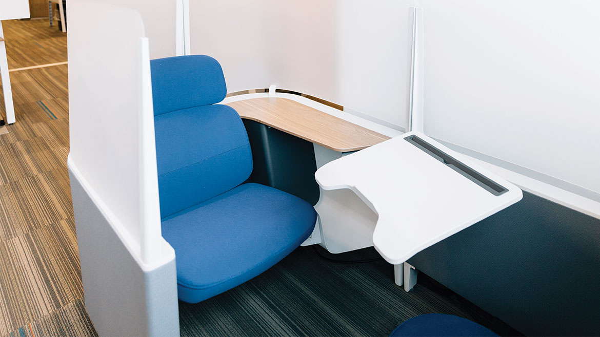
As a result, more and more office buildings are renovating to include spaces with varying levels of privacy: collaboration areas, multi-purpose rooms, smaller “huddle rooms” or conference rooms, and semi-private areas for individual use.
“Employees want options,” Brandt says. “They want distraction-free work areas when they need quiet, but they also want collaborative areas where they can meet as a group.”
Frank Sovich, owner and dealer principal at Marathon Building Environments, refers to part of this trend as “hoteling” or creating “touchdown spaces.” These offices cater to employees who don’t work from a “home base,” so to speak — they may have the option of utilizing a common space for meetings or laptop work, and they may include a locker for their employees’ belongings.
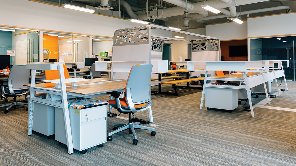
Marathon utilized touchdown design in part of their work with the Missouri Innovation Center, a 3,000-square-foot building for startups. The MIC features a combination of private offices and open, collaborative workspaces.
“In these open, collaborative spaces, there’s more of a casual and residential feeling,” Sovich says. He notes that such a space may include more couches and soft seating than a private workspace typically would.
The open space at the MIC features a picnic table and whiteboards. Other options include everything from booths and couches to traditional desks and chairs, plus lockable cabinets on wheels that double as seating for clients.
“In the past, you may have dedicated a room to a conference table and conference chairs,” says Brandt. “Now, [with new design plans] there may not be anyone at the head of the conference table. We’re creating spaces for collaboration and providing furnishings that invite employees to speak their mind and bring forward innovative ideas.”
But what if some employees prefer more privacy, like the introverts on the team? Sovich says that not everyone will feel comfortable if you take down the cubicle walls. A partial cubicle wall design is becoming a popular feature in some workplaces — it allows employees to interact while still maintaining some privacy.
“A few years ago, we started seeing the cubicle walls come down,” Sovich says. “What we’re seeing now is the walls coming back up, but partially — about 12 to 24 inches.”
Tech Savvy and Body Wise
There’s a fairly overwhelming array of workspace designs to choose from featuring everything from common spaces to cubicles. When planning office design, it helps to consider function and form together. One design methodology that can help businesses determine what type of layout is best for their needs is called “activity-based planning.”

“The employer tells me which tasks their employees do, and I’ll design specific spaces based upon this, resulting in optimal employee performance,” explains Brad Eiken, principal at Inside the Lines commercial interiors. “This also helps with the utilization of real estate.”
In many of these newer collaboration design spaces, one would find what Brandt calls more “loungy” pieces — places employees can comfortably sit with their digital devices. The furniture sometimes includes built-in data and electrical ports to charge a laptop, tablet, or phone.
“We have several projects in the works that are integrating more technology into their furniture to allow employee mobility,” Brandt says. “This type of environment fosters more creative and interactive engagement. The right furniture choices can provide comfort as well as functionality, and the right company is paying increased attention in their furnishings for their employees.”
Sit-to-stand desks have also been popular in recent years and are continuing to gain traction among health-conscious employees. “Sitting is the new smoking,” Sovich says.
Such designs range from actual adjustable desks to apparatuses that sit on top of a desk. But what if standing and typing isn’t your cup of coffee? “People think sitting on a yoga ball is good for their core,” explains Sovich. “Short term, it is, but ergonomically, it’s not good for the long term.”
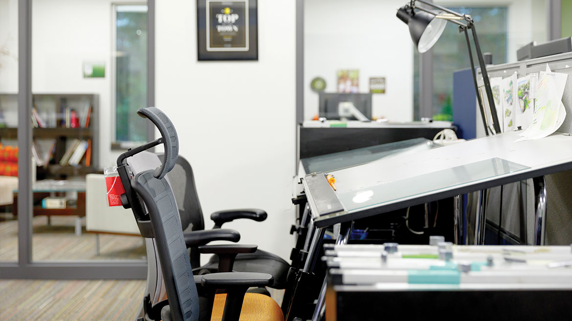
As a solution for sitters, Sovich recommends buying an ergonomically correct chair with a warranty that features proper spine support and tension control. For the best results, find a chair that’s specifically fitted for you. Even better, you can bring the professionals to you. Working Spaces, Marathon, and Inside the Lines all conduct on-site ergonomic workstation evaluations.
“The companies that take the time to do the evaluations care so much about their employees, who then become happier and more productive,” Brandt says. “It’s a win-win for everyone.”
All About Aesthetics
“Old, outdated environments do not promote creative, proactive thinking,” Eiken says. “Educational environments are changing to keep pace with attraction. When new workers join the workforce, they’re looking for environments that are similar to their learning environment.”
Eiken says that two concepts known as “biophilic design” and “resimercial design” are creating more welcoming atmospheres. The former incorporates more nature into the workplace by bringing in natural finishes, lighting, acoustics, and feng shui principles to improve the health, well-being, and, therefore, productivity of the working environment.
“When you’re in the health care and educational environments, you don’t want to feel static or sterile,” Eiken says. “You want to feel homey.”
Which brings us to resimercial design (a portmanteau of residential and commercial), which aims to create a more home-like feel in the office by bringing in softer materials, comfortable and casual seating, mood-setting lighting, and more eclectic finishes (think lots of glass, wood, and fabrics).

“Products are getting some depth to them,” Eiken says. “They may have curves and natural materials; it’s not just a sterile, painted floor or wall anymore. For example, in a current project we’re using old barn wood, and we’ve used brick veneer wall application before.”
Another product Eiken cites as an example is the live-edge table, which is just a slab of wood left with the edge unfinished so it isn’t perfectly rounded or squared. He’s also seeing more color.
“In terms of color, things are going away from a white base,” Sovich agrees. “We’re seeing darker bases with pops of color. And we’re seeing a lot more color and texture in carpeting. Many trends start from the carpet, so usually we start at the carpet and work our way up.”
Creature Comforts
“People are your number one commodity,” says Sovich. “If you build an office that caters to your employees and keep it fresh and vital, you get the returns you want. It makes a statement about your business.”
Some workplaces are embracing the trend of “perks,” the features of an office that aren’t directly associated with actually doing work. Think gaming stations, napping areas, basketball hoops, and other furnishings.
“It has to be in the right work environment,” Sovich says. “It goes business by business. In our office, for example, we give employees the freedom to come and go. I could put a pingpong table in here, but no one would use it because they’re out selling.”
Eiken notes that a better designed break room or outdoor area may also improve the office environment and, therefore, employee creativity.
“A lot of people aren’t leaving the premises for lunch break if they’re provided with an attractive dining area and functional kitchen,” says Eiken. “I don’t mind staying at the office for lunch, but I’m not going to sit in a boring break room.”
Eiken says an outdoor area may include picnic tables or even lawn games for employees to play in their downtime, but it’s basically “just having an area to get outside so you’re not stuck inside all day.”
It’s about creating a space where people want to go, not where they have to go, Eiken says.
What the Future Holds
Eiken envisions the use of creative
textures and materials, technology integration, and mood and sensory stimuli to continue developing in the future. He also thinks we’ll see an increase in architectural products in offices at the expense of traditional construction items (moveable walls versus drywall, for example).
“They’re a huge tax advantage, since they can be depreciated, and have greater flexibility and reusability,” Eiken says.
Sovich says the size of office space has been getting smaller and likely will continue to do so.
“Your workplace speaks your brand, both for employees and clients,” says Eiken. “It helps with attraction and retention of employees as well as customers, and it assists with employee performance.”
We’ll be sitting on pins and needles (ergonomically correct, of course) to see what the next new workspace trend will be.


